- Tags: "Design", "First Home Buyers", "First National News", "Gold Coast Property", "How To", News, "Palm Beach", "Property Investment", "Real Estate", "Top Read"
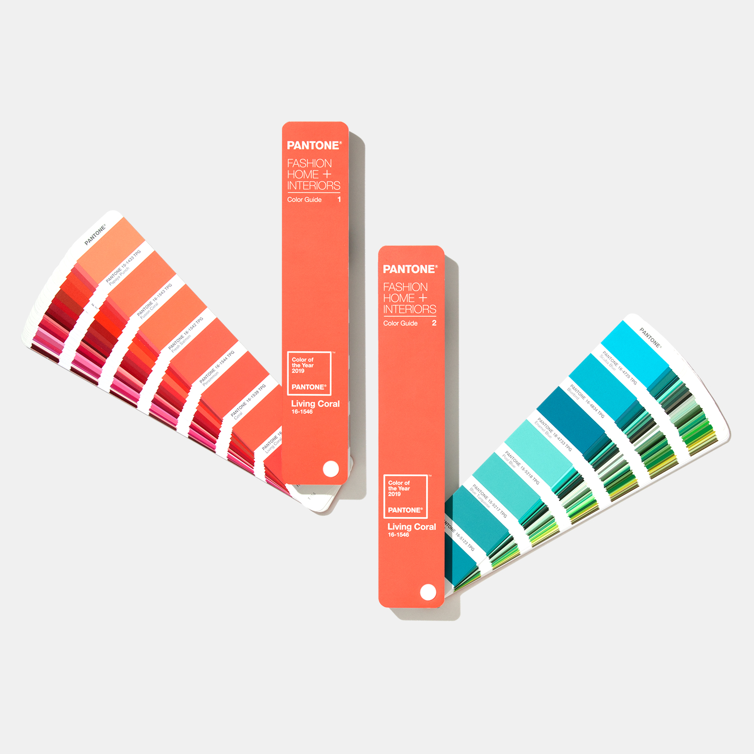
Pantone’s Colour of the Year 2019 is Living Coral
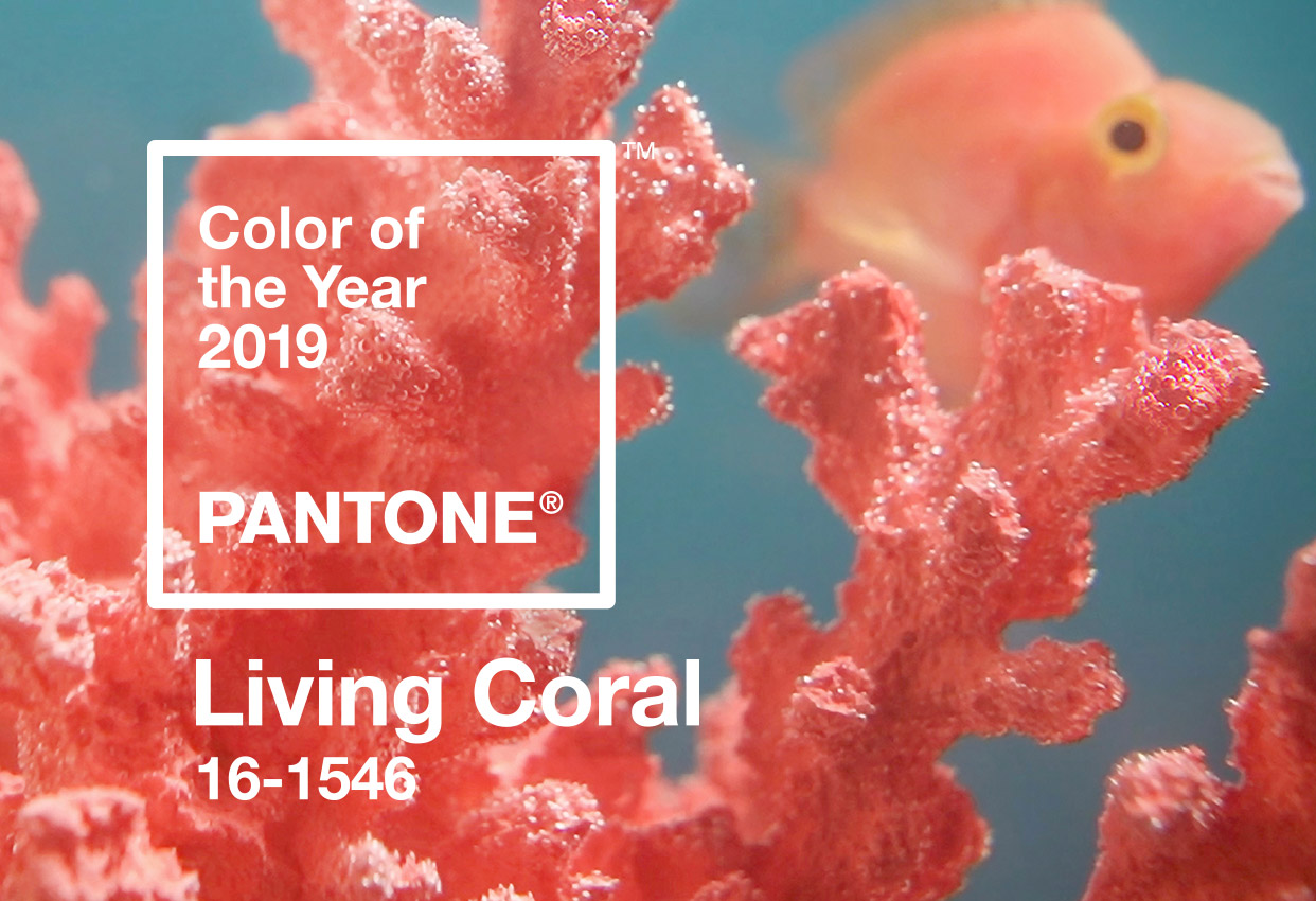
“Living Coral is evocative of how coral reefs provide shelter to a diverse kaleidoscope of colour,” says the Pantone Colour Institute.
The vivacious shade is described as an “animating and life-affirming coral hue with a golden undertone that energises and enlivens with a softer edge”.
Colour authority Pantone has announced its long-anticipated Colour of the Year for 2019 as Living Coral.
According to the official press release, the warm and nourishing hue was specifically chosen to provide a sense of comfort and buoyancy in our continually shifting environment.
“In reaction to the onslaught of digital technology and social media increasingly embedding into daily life, we are seeking authentic and immersive experiences that enable connection and intimacy,” the press release says.
“Sociable and spirited, the engaging nature of Pantone 16-1546 Living Coral welcomes and encourages lighthearted activity.”
“This vivifying and effervescent colour mesmerises the eye and mind,” says Pantone.
Why is Living Coral Pantone’s Colour of the Year 2019?
Living Coral is said to be the perfect fusion between two prevalent aspects in our daily lives. The shade is, of course, found throughout the natural world in florals and yes, coral, but is also frequently splashed across the many social media platforms that we scroll each day.
“Color is an equalising lens through which we experience our natural and digital realities and this is particularly true for Living Coral,” says Leatrice Eiseman, executive director of the Pantone Color Institute.
“With consumers craving human interaction and social connection, the humanising and heartening qualities displayed by the convivial Pantone Living Coral hit a responsive chord.”
How to use Living Coral in the home in 2019
While Living Coral can quite easily make a bold statement in decor and settings in the home, it’s also easily subdued and toned down.
According to Pantone: “As a colour linked to tactility and human connection, Living Coral in shag rugs, cosy blankets and lush upholsteries create a warm, comforting and nurturing feeling in the home.
“With its ebullient nature, Living Coral adds a dramatic pop of colour to any room setting whether in decorative accessories, tabletop, or on the wall.”
Looking for some ideas? We’ve rounded up three different ways to use Living Coral in your home this year.
1. A statement wall
Statement ceilings have been trending upwards for some time, and we happen to think a toned down shade of Living Coral would be perfect for brightening up an otherwise simple space.
2. Mirror, mirror, on the wall
This coral-toned mirror accessory from IKEA is the fairest of them all. The Honefoss mirror makes for a truly unique and decorative addition to any wall that’s lacking a little oomph.
3. Bright pops in homewares
We happen to think the best way to add a touch of Living Coral is with cute handmade decor pieces, like planter pots. Not only does the colour contrast spectacularly against green leaves, but these planters look adorable clustered together thanks to the varying hues.
by Katie Skelly (Source: REA)
Pantone's Colour of the Year 2019 is Living Coral palmbeachfn.com.au December 2018 First National Palm Beach
Cnr of 6th Ave & Cypress Terrace, Palm Beach, QLD 4221 Ph: 07 5559 9600